Coming soon
Templates and Formats

Modern Resume Format: How to Look Current Without Breaking ATS

What makes a modern resume format work: clean type, white space, one accent color and a single column. Compare modern, creative and classic styles here.

Mira Resume Editorial Team · Career content team Published Updated 8 min read
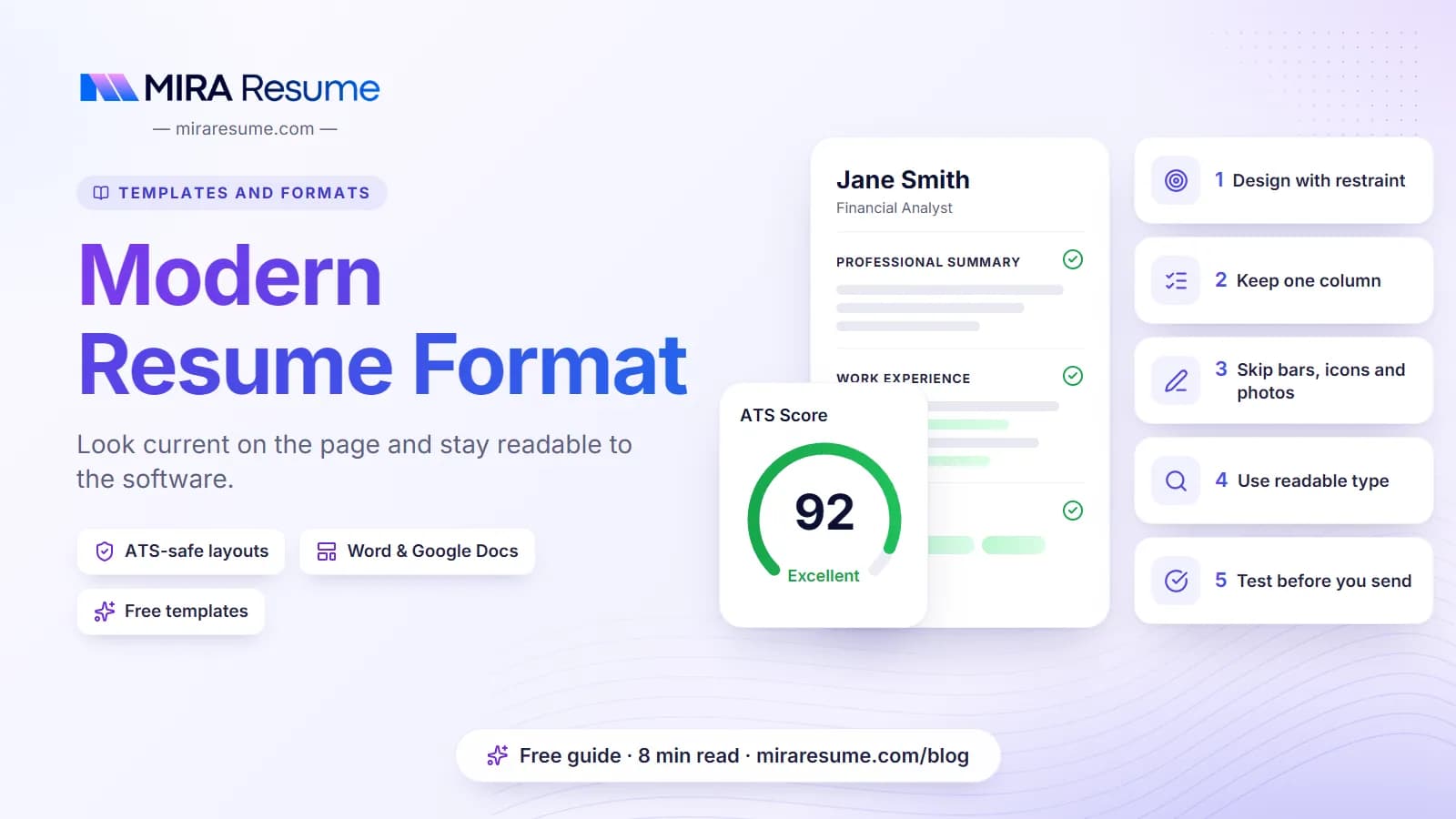
Modern Resume Format: cover image for the Mira Resume guide, with an example resume and the 5 main points

A modern resume format should make you look current without making your resume harder to read. That sounds obvious, but many designs sold as "modern" rely on two columns, icons, skill bars and photos. Those can confuse the applicant tracking systems (ATS) that many employers use, and they slow down human readers too.

This guide explains what modern really means on a resume today: clean type, generous white space, one accent color and a single column with clear headings. It compares modern, creative and classic styles, lists which design choices are safe and which are risky, and gives a layout you can copy into Word or Google Docs.

Want to skip ahead? Browse our modern resume templates or the full resume template guide, many of them single-column and built to read well in hiring software.
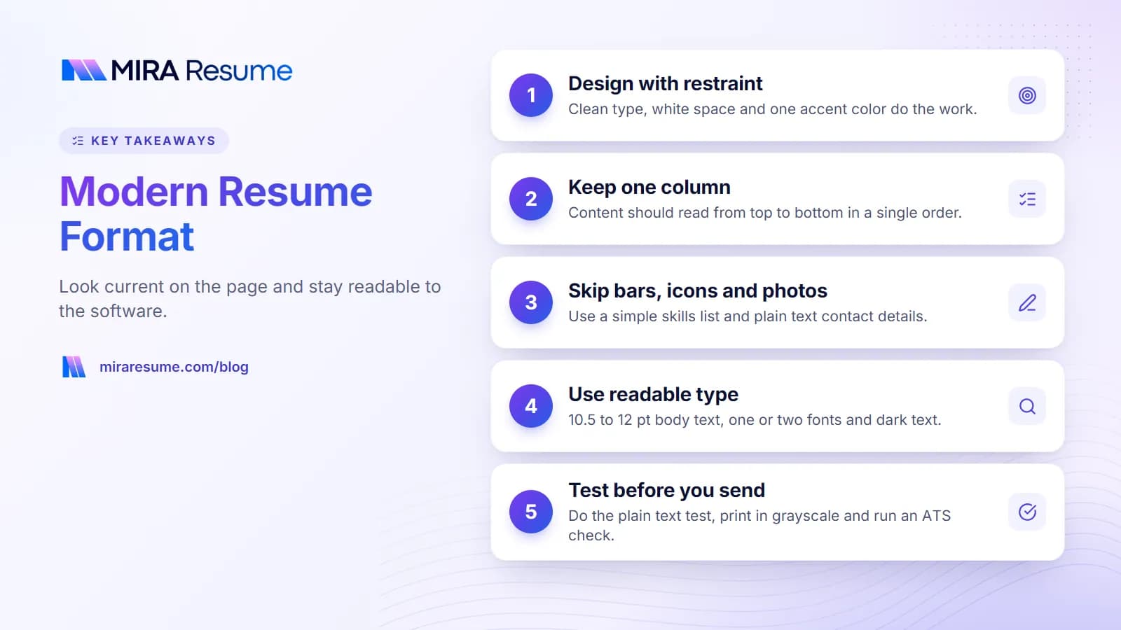
Key takeaways: 1. Design with restraint; 2. Keep one column; 3. Skip bars, icons and photos; 4. Use readable type; 5. Test before you send
Key takeaways from this guide.

What "modern" means on a resume

Modern resume design is about restraint. The look comes from typography and spacing, not from decoration. A modern layout usually has:

  • Clean typography. One or two fonts at most, with a clear size difference between your name, section headings and body text.
  • White space. Comfortable margins, even line spacing and a little extra room between sections, so the page does not feel crowded.
  • One accent color. Used on your name, headings or thin divider lines, and nowhere else.
  • A single column. Content reads from top to bottom in one order, which suits both people and software.
  • Clear, standard headings. Summary, Experience, Education, Skills.
  • Concise, results-led content. A short summary instead of an objective, bullets that show outcomes, and a link to LinkedIn or a portfolio.

What modern does not mean: text inside images, skill bars and star ratings, icons that replace words, infographic timelines, or a photo on applications in countries where photos are not expected, such as the US, Canada and the UK.

Modern resume format vs modern resume design

The two are different. Format is the order of your information, and for most people a modern resume format is still reverse-chronological, with your newest job first. Design is how the page looks. You can put a fresh design on a classic format, and that is usually the best combination. For more on how the finished page should look, see what a resume should look like.

Modern vs creative vs classic resume templates

Most templates fall into one of three styles. Here is how they compare.

ModernCreativeClassic
LookClean sans-serif or modern serif, generous spacingBold colors, graphics, unusual layoutsTraditional serif, dense text
LayoutSingle column, clear sectionsOften two columns, sidebars and iconsSingle column
ColorOne accent colorSeveral colors or color blocksBlack and white
Best forMost office, tech, business and healthcare rolesDesign, media and arts roles, usually alongside a portfolioLaw, finance, government, academia and conservative employers
ATS riskLow, if built correctlyMedium to highLow
Main weaknessCan look generic if the content is weakSoftware may misread the layoutCan look dated

Modern is the middle path: it looks fresher than a classic layout but keeps the same simple structure underneath. If you work in a visual field and want to push further, our creative resume examples show how to do it without losing readability. If you prefer something even plainer, see our simple resume format.

Design choices that keep a modern resume ATS-friendly

An ATS pulls the text out of your file and sorts it into fields such as name, job titles and skills. It reads in order, and it can only use real text. Graphics may be skipped, and columns may be merged into one confusing stream. These swaps keep the modern look and remove the risk.

ElementSafe modern versionRisky version
ColumnsOne columnTwo or three columns, sidebars
ColorOne dark accent on headings or rulesColored backgrounds with light text
Contact detailsPlain text at the top of the page bodyIcons only, or details only in the document header or footer
SkillsA simple list of keywordsBars, stars, pie charts or percentages
HeadingsStandard words: Experience, Education, SkillsClever labels such as "My Journey" or "Superpowers"
DividersThin horizontal linesHeavy boxes and shaded tables
ImagesNoneHeadshots, company logos, text saved as an image
TextReal, selectable textWords inside graphics or shapes

Not every system behaves the same way, so the safest approach is to design for the simplest one. Our guides on how ATS works and scannable resumes explain the details.

Modern resume format: the section order

A clean design works best with a clear order. This one suits most people:

  1. Header. Your name in a larger size, an optional target title underneath, then one line with city, phone, email and LinkedIn.
  2. Summary. Three or four lines on who you are, what you are good at and one result.
  3. Skills. Eight to twelve hard skills and tools that match the job post.
  4. Experience. Newest job first, with title, employer, location and dates, then three to six bullets.
  5. Education. Degree, school and year, plus honors if relevant.
  6. Optional sections. Certifications, projects, languages or volunteering, if they support the role.

Students and recent graduates can move education above experience; see our resume format for freshers. If you have a long career, our resume format for experienced professionals shows how to keep a modern layout to two pages.

Fonts, color and spacing for modern resume design

Small typographic choices do most of the work in a modern design. These ranges are a good starting point.

ElementRecommended
Body fontCalibri, Arial, Helvetica, Lato or Source Sans; Georgia for a softer serif look
Body size10.5 to 12 pt
Name18 to 26 pt
Section headings12 to 14 pt, bold or small caps
Margins0.5 to 1 inch (about 1.3 to 2.5 cm)
Line spacing1.0 to 1.15
Accent colorNavy, dark teal, forest green, burgundy or charcoal

A few rules for color. Keep body text black or very dark gray, because light gray text is hard to read. Check that your accent color still looks fine when printed in grayscale. And never use color alone to carry meaning, such as marking your strongest skills in green.

If you send a .docx file, choose a font the reader is likely to have, or the layout may shift on their screen. Sending a PDF keeps your font in place. For more detail, see our guides to resume fonts and resume margins.

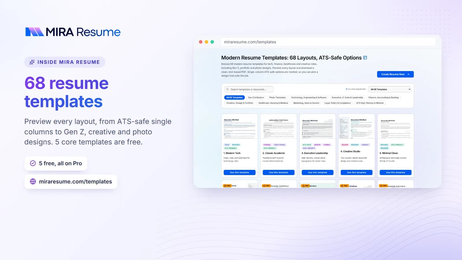
Screenshot of the Mira Resume 68 resume templates (Preview every layout, from ATS-safe single columns to Gen Z, creative and photo designs. 5 core templates are free.)
Screenshot: 68 resume templates: Preview every layout, from ATS-safe single columns to Gen Z, creative and photo designs. 5 core templates are free.Try it

Modern resume templates in Word and Google Docs

You do not need a design tool to get a modern look. Word and Google Docs can produce a clean, readable resume if you build it the right way.

  • Use built-in heading styles so every section heading looks the same and is easy to change at once.
  • Use paragraph spacing instead of blank lines, so gaps stay even.
  • Avoid text boxes and layout tables. They are the most common cause of jumbled text when a file is parsed.
  • Use a right-aligned tab stop for dates, rather than spaces or a hidden table.
  • Keep contact details in the main body, not only in the document header.
  • Export to PDF and test it by copying all the text into a plain text editor.

Our guides to Microsoft Word resume templates and Google Docs resume templates walk through the settings step by step. If you like the look of design-app templates, read our notes on Canva resume templates first, since many are graphic-heavy.

Modern CV template: notes for the UK, Europe and beyond

The same principles work for a modern CV template outside the US. A few things change:

  • Paper size. Use A4 rather than US Letter in the UK, Europe, India, Australia and most other countries.
  • Name. The document is usually called a CV, and British spelling is expected in many markets.
  • Photo. Customs vary. Photos are common in parts of Europe and the Gulf, but usually left off in the UK, Ireland, the US and Canada.
  • Length. Two pages is normal for experienced candidates in many countries.

See our CV templates guide, the ATS-friendly CV template, the Europass CV page for parts of Europe, and our hub of CV formats by country for local rules.

A modern resume layout you can copy

Here is a fictional example showing how a modern layout reads as plain text. The name, company and numbers are made up.

JORDAN LEE
Marketing Analyst
Austin, TX | (512) 555-0192 | [email protected] | linkedin.com/in/jordanlee

SUMMARY
Marketing analyst with four years of experience in B2B software. Builds dashboards and campaign reports that marketing teams use every week. Raised lead-to-opportunity conversion from 9% to 13% by reworking lead scoring with the sales team.

SKILLS
Google Analytics | SQL | Looker Studio | HubSpot | A/B testing | Attribution modeling | Excel

EXPERIENCE
Marketing Analyst, Fernhill Software, Austin, TX | 2023 – Present

  • Rebuilt lead scoring with sales, raising lead-to-opportunity conversion from 9% to 13% in two quarters.
  • Created a weekly campaign dashboard used by 12 marketers, replacing four separate spreadsheets.
  • Ran 20 email A/B tests in a year and documented the winners in a shared playbook.

EDUCATION
B.B.A. Marketing, [University name], 2021

To give this a modern look in your editor: set the name in your accent color at about 22 pt, put each heading in the same accent color with a thin line under it, right-align the dates with a tab stop, and keep everything else black. That is the whole design.

Check your modern resume before you send it

  1. Do the plain text test. Copy everything from your PDF into a plain text editor. If the order is wrong or words are missing, the layout needs simplifying.
  2. Check the text is selectable. If you cannot highlight a word, software cannot read it either.
  3. Print it in grayscale. Headings should still stand out.
  4. Look at it on a phone. Many recruiters first open resumes on mobile.
  5. Run an ATS check. Our ATS checker shows how your file reads and which keywords are missing.
  6. Tailor the content. Adjust your summary and skills for each job, even if the design stays the same.

Common mistakes with modern resume templates

  • Picking the template before writing the content. Write first, then choose a layout that fits the amount you have.
  • Over-designing. Each extra color, icon or shape is one more thing for the reader to process.
  • Shrinking the font to fit. Cut words instead. Below about 10 pt, text gets hard to read.
  • Light gray body text. It looks elegant on a bright screen and faint everywhere else.
  • Mixing too many fonts. Two is the limit; one is often better.
  • Relying on design to stand out. Strong, specific bullets do more than any layout.

Ready to start? Browse the full gallery of modern resume templates, pick one with a single column, and fill it in with our resume builder.

Frequently asked questions

What is a modern resume template?

A modern resume template is a clean, current layout that uses simple typography, generous white space, one accent color and a single column with standard headings. It looks fresh without relying on graphics, photos or skill bars, so it stays easy for both recruiters and applicant tracking systems to read.

Are modern resume templates ATS-friendly?

Many are, but not all. A modern template is usually ATS-friendly if it uses one column, real selectable text, standard section headings and no text inside images or graphics. Templates with sidebars, icons, skill bars or text boxes carry more risk. Test yours by copying the text into a plain text editor.

Can a modern resume have color?

Yes. One dark accent color, such as navy, teal or forest green, used on your name, headings or divider lines is a common modern touch. Keep body text black or very dark gray, avoid colored backgrounds, and check that the resume still reads clearly when printed in grayscale.

Should a modern resume have a photo?

In the US, Canada, the UK and Ireland, photos are usually left off resumes, and a modern design does not need one. In parts of Europe, the Gulf and Asia, photos are more common. Follow local norms and the job advert, and keep the photo out of any text areas the software needs to read.

Is a two-column resume modern?

Two-column layouts often look modern, but they carry more risk with applicant tracking systems, which may read the columns in the wrong order. A single column with clean typography and an accent color gives a similar modern feel with less risk. If you use two columns, keep your work history in the main column.

What font is best for a modern resume?

Clean sans-serif fonts such as Calibri, Arial, Helvetica, Lato or Source Sans suit most modern resumes. Georgia works if you want a softer serif look. Use 10.5 to 12 pt for body text, one or two fonts at most, and send a PDF if you use a font the reader may not have installed.

Found this useful? Share it

Send it to a friend who is job hunting, or save it for later.

Read this guide with AI

Get a plain-language summary and help applying it to your own resume. Pick an assistant; it opens with this article and a ready prompt.

Back to Templates and Formats hub

All articles