
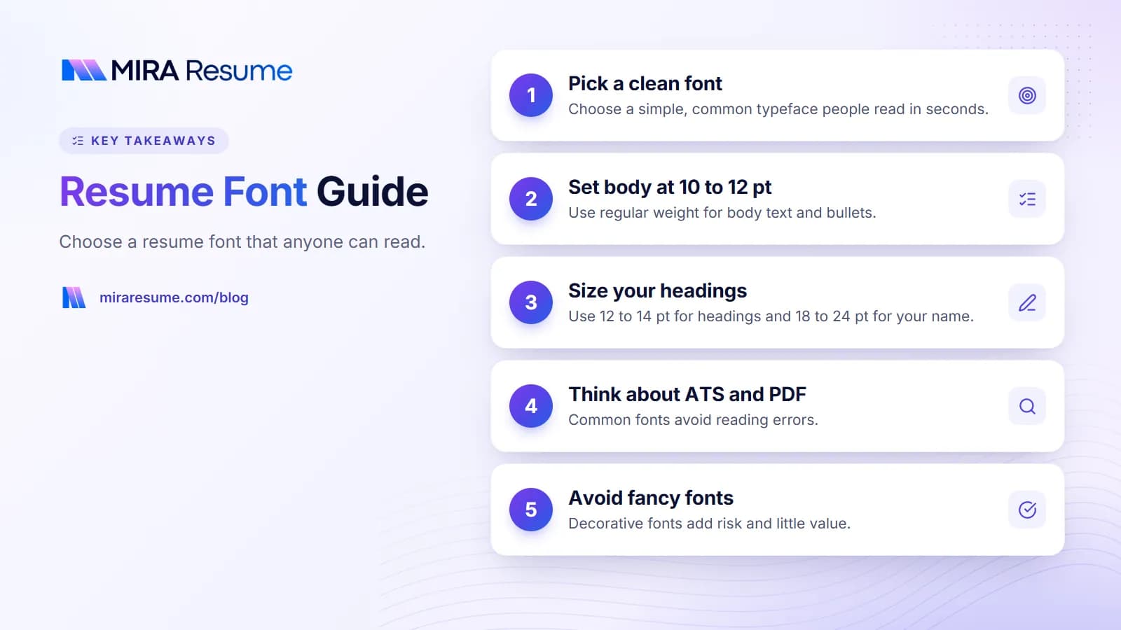
The right resume font is one that people can read in seconds and software can read without errors. You do not need anything clever. A simple, common typeface in a size between 10 and 12 points does the job.
This guide answers the usual questions: which fonts are safe, what size to use, whether Calibri is fine, and what happens to your font when you save a PDF. It also shows what to avoid and how to check your file before you send it.
What font should a resume be in?
Use a plain, widely available font that is easy to read on paper and on screen. Good fonts have clear letters, even spacing, and a normal weight. Three rules cover most cases.
- Choose one font family. You may use two at most, such as one for headings and one for body text.
- Pick readability over style. If two letters look alike (such as capital I and lowercase l), try a different font.
- Use bold and size for structure. Skip decorative styles, shadows, and outlines.
Both serif fonts (with small strokes on letters) and sans-serif fonts (without) work. Sans-serif is the most common choice for screens. A simple serif can look classic and calm on a printed page.
Safe fonts for a resume: table
These are common fonts that read well. Where we mention a size, it is a starting point, since each font looks bigger or smaller at the same point value.
| Font | Style | Body size to try | Notes |
|---|---|---|---|
| Calibri | Sans-serif | 11 pt | Familiar and clean. Runs a bit small, so 11 is usually better than 10. |
| Arial | Sans-serif | 10 to 11 pt | Available almost everywhere. Plain look. |
| Helvetica | Sans-serif | 10 to 11 pt | Similar to Arial. Common on Mac. |
| Verdana | Sans-serif | 10 pt | Wide letters. Easy to read, but takes up room. |
| Georgia | Serif | 10 to 11 pt | Designed for screens. Warm look. |
| Times New Roman | Serif | 11 to 12 pt | Very standard. Some find it dated. |
| Cambria | Serif | 11 pt | Clear and compact. |
| Garamond | Serif | 11 to 12 pt | Looks small at standard sizes, so go up a point. |
Not every font is installed on every computer, which matters when you share an editable file. Saving as a PDF solves that, which we cover below.
Is Calibri a good font for a resume?
Yes. Calibri is a clean sans-serif that many people use for resumes, and it is easy to read at 11 points. It is the default in many Microsoft Office versions, so employers see it all the time. That is a plus and a minus: it is safe, but it does not stand out.
When Calibri works well
- You are applying through an online portal.
- You want a neutral look for a traditional field, such as finance or healthcare.
- You are building your resume in Word.
When to consider another font
- You want a bit more personality, as in design or marketing. A softer serif or a modern sans-serif can help.
- You want a font that is not the default of every other file the recruiter sees.
Either way, the content matters more than the typeface. If you are comparing formats, our guide to how to format a resume covers margins, spacing, and order.
Resume font size: what to use
Set sizes by role in the document, not by guessing. This table gives a good starting range.
| Part of resume | Suggested size | Style tip |
|---|---|---|
| Your name | 18 to 24 pt | Bold or slightly larger. Keep it on one line. |
| Section headings | 12 to 14 pt | Bold, maybe in capitals |
| Job titles and company names | 11 to 12 pt | Bold for the title |
| Body text and bullets | 10 to 12 pt | Regular weight |
| Contact details | 10 to 11 pt | One line if possible |
Do not shrink to fit
If your text only fits at 9 points, you have too much text. Cut the oldest or least useful lines instead. Small type is hard to read, especially for tired recruiters or people on a phone. Our guide on how many pages a resume should be helps you decide what to trim.
Line spacing and margins
Use line spacing of about 1.0 to 1.15, and margins of roughly 0.5 to 1 inch. Leave a little white space between sections. Crowded pages look tiring.
Fonts and ATS: what matters
Applicant tracking systems read the text in your file, not how it looks. So the font itself is usually not the issue. What matters is whether the text can be pulled out cleanly.
| Choice | Safer or riskier | Why |
|---|---|---|
| Common, standard font | Safer | Text is stored in a normal way |
| Decorative or script font | Riskier | Harder for people to read, and sometimes for software |
| Text turned into an image | Riskier | Software cannot read pictures of words |
| Special symbols as bullets | Riskier | Unusual characters may show as boxes |
| Very tiny or very large text | Riskier | Hard to read and may confuse layout |
We cannot say how every system treats every font, because they differ. Our guide on how ATS works explains the general process. The most reliable step is to test: run your PDF through the ATS checker and see if the text comes out right.
Resume fonts in PDF files
When you save a resume as a PDF, a good export embeds the fonts. That means the font data travels inside the file, so the recruiter sees what you designed, even if they do not have that font installed.
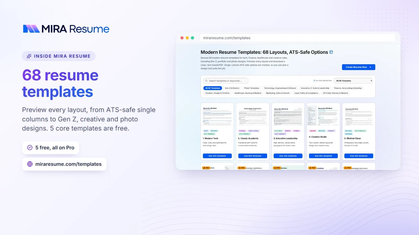
All Mira Resume downloads are PDF. Our templates use fonts such as Inter, Source Sans 3, Lora, and Playfair, and these are embedded in the file when you download it. Inter and Source Sans 3 are clean sans-serif choices, Lora is a soft serif for body text, and Playfair is a display serif best used for a name or a heading. You can browse the options in our resume templates.
Check your own PDF
- Open the PDF and try to select a line of text with your cursor. If you can, it is real text.
- Copy a few lines into a plain note. Words should come out in order, with no odd characters.
- Look at the file properties in your PDF viewer, where fonts are often listed as "embedded."
If you are working in Word, our guide to Microsoft Word resume templates covers tips for the editable file.
Fonts to avoid on a resume
The fonts below are not forbidden, but they cause more trouble than they are worth.
- Script and handwriting fonts. Pretty, but hard to read in small sizes.
- Comic Sans and similar casual fonts. Most employers see them as unserious for a resume.
- Heavy display fonts for body text. Fine for a name, tiring for paragraphs.
- Very thin fonts. Light strokes can fade when printed or viewed on a low-quality screen.
- Rare downloaded fonts in an editable file. If the reader does not have them, the layout may break. Use PDF or stick to common fonts.
- Mixing three or more fonts. It looks messy and makes the page harder to scan.
Creative fields have a little more room, but the same readability rule applies. See our creative resume examples for ways to show style without hurting readability.
Common resume font mistakes
- Changing fonts for emphasis. Use bold or italic, not a new typeface.
- Inconsistent sizes. Make every job title the same size and every heading the same size.
- Underlining everything. Underline can look like a link. Use bold instead.
- All caps for long lines. Capitals are slower to read. Keep them for short headings.
- Choosing a font after the text is done. A change can push a line to page two. Pick the font first, then edit.
- Ignoring the final check. Print or preview your PDF. Look for broken lines, odd symbols, or cut-off words.
For more on the things that matter beyond type, see our ATS-friendly template guide.
Match your font to your field
The font should feel normal for the job you want. When in doubt, lean plain.
| Field | Good direction | Why |
|---|---|---|
| Healthcare, finance, law, government | Arial, Calibri, Cambria, Times New Roman | Readers expect a traditional look |
| Technology and startups | Clean sans-serif such as Inter, Source Sans 3, or Calibri | Modern and neutral |
| Education and nonprofits | Georgia, Garamond, or a clean sans-serif | Warm, readable, not flashy |
| Design, marketing, media | Sans-serif body with one serif heading font | Shows taste without hurting readability |
| Trades, retail, hospitality | Arial or Calibri at 11 pt | Easy to read quickly |
Test it on paper and on a phone
Many recruiters open resumes on a phone, and some still print them. Look at your PDF at both sizes. If a line is hard to read on a small screen, increase the size or change the font. Letters that touch, such as in very tight fonts, are a warning sign.
Keep the rest simple, too
A good font cannot rescue a crowded page. Use clear section headings, steady spacing, and short bullets. Our things to put on a resume guide helps you decide what earns a place on the page, so type has room to breathe.
A quick font checklist before you send
- One font family, or two at most.
- Body text at 10 to 12 points, headings a bit larger.
- Name at the top is the largest text on the page.
- Bold is used the same way on every job title.
- The file is a PDF with selectable text.
- You tested it with a checker, and the text reads in the right order.
If you want a layout where font pairs, spacing, and headings are already set up, an resume builder can handle the design so you focus on the words.
What to do if your resume spills onto page two
Do not fix it by shrinking the font. First cut weak or old bullets, then tighten spacing a little, and only then trim margins slightly. If one or two lines still spill over, remove a bullet instead. A clean one-page resume at 11 points beats a crowded page at 9.5 points every time. Check the page in both your editor and the final PDF, because small differences in spacing can push a line onto the next page. Read the PDF on screen one last time before you upload it anywhere.