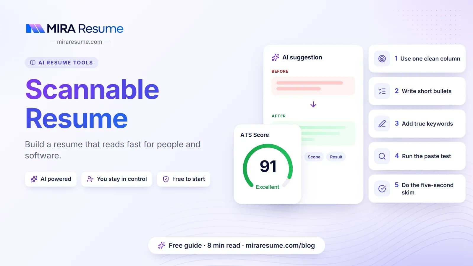

A scannable resume is one that is easy to scan in two senses. Software can read the file and sort it into the right fields, and a busy person can skim the page and understand who you are in a few seconds. The word has an older meaning too, from the days when employers scanned paper resumes into a computer. Today it mostly means a clean, simple, well-organized document. This guide shows you how to build one, what to avoid, and how to test your own file in minutes.
What makes a resume scannable
A resume can be scanned by a machine or by a human eye. A good one handles both.
Scannable by software
- The file has real text that can be selected and copied.
- The layout reads in one clear order, top to bottom.
- Headings use standard names so a parser can place each section.
- Dates and job titles are written in a consistent way.
Scannable by people
- Your name and target role stand out at the top.
- White space separates sections.
- Bullets are short, and each starts with a strong verb.
- The most important facts sit near the top of each section.
Recruiters often give each resume a quick first look before they decide to read more, so a scannable layout gives your best points a chance to be seen. The same traits help with software. For the background on how software reads your file, see what is an ATS resume and ATS resume scanners.
The old meaning of "scannable"
Years ago, some employers scanned paper resumes with optical software, and advice from that time said to avoid italics, underlines, and special fonts. Today most resumes arrive as digital files, so the main goal is a file with selectable text. Still, plain formatting remains a good habit.
A scannable resume layout, step by step
Follow this order from top to bottom.
- Header. Your name in a larger size, then city, phone, email, and an optional profile link on one or two lines.
- Summary. Two or three lines on who you are and what you want.
- Skills. A short, simple list of tools and skills you use.
- Work Experience. Newest job first. Title, company, location, and dates, then short bullets.
- Education. Degree, school, and year.
- Extras. Certifications, projects, or languages when they help.
Basic formatting settings
| Element | Good choice | Why |
|---|---|---|
| Columns | One | Software reads in a straight line |
| Font | A common, clean font, 10 to 12 points | Easy on the eye, reads reliably |
| Margins | About 0.7 to 1 inch | Leaves room to breathe |
| Headings | Bold, same size, standard names | Quick to find and easy to parse |
| Bullets | Plain round bullets | Rare symbols can break |
| Length | One page for early careers, two if needed | Short pages get skimmed fully |
For more on spacing and structure, read how to format a resume and how many pages a resume should be. If you want a ready layout, browse the resume templates and pick the simplest one that suits your field.
Write bullets people can skim
The way you write matters as much as the layout. Readers skim, so give them clear landing points.
Keep each bullet short
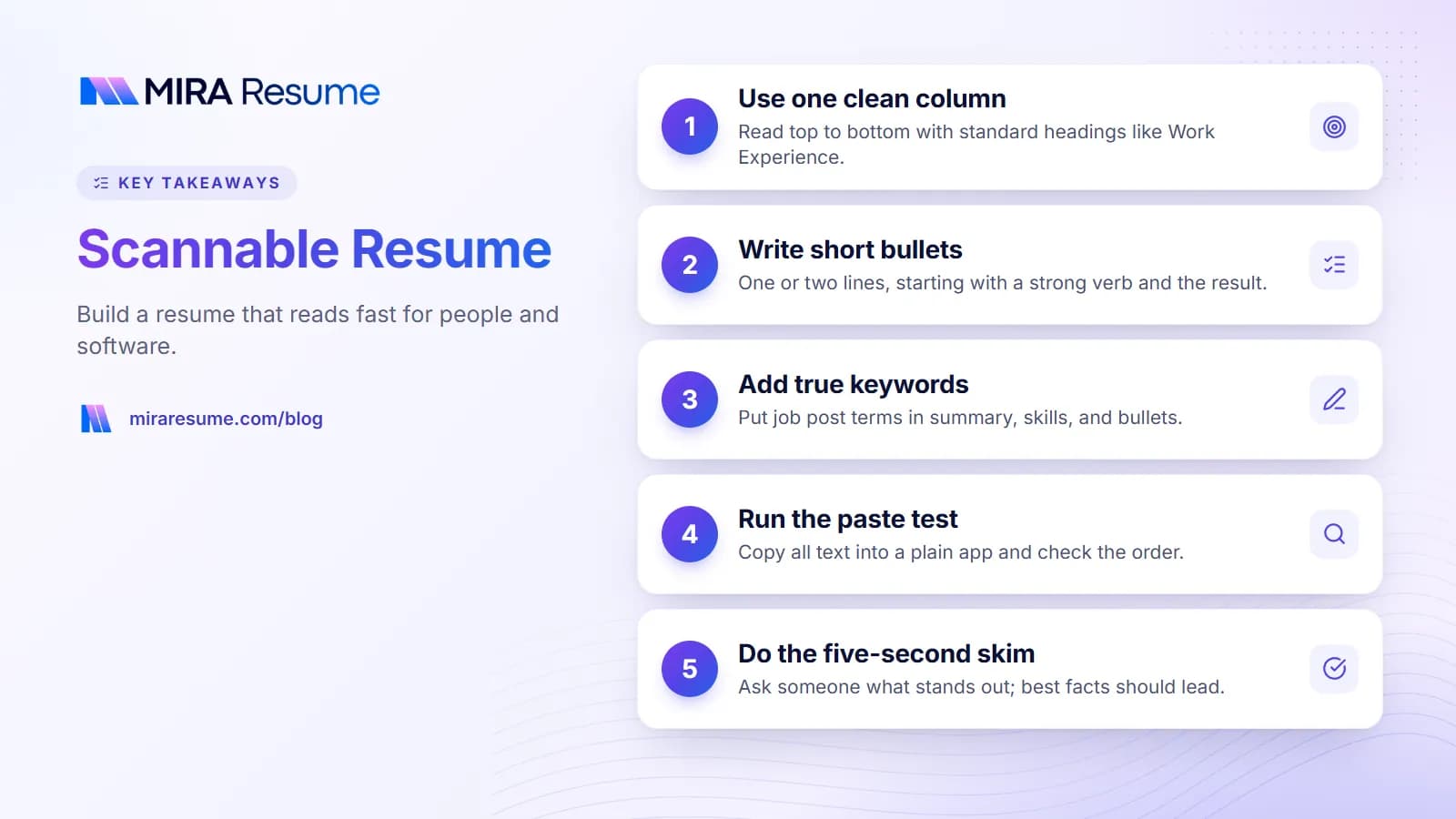
Aim for one or two lines. A long block of text hides the point. Put the most important part first, such as the action and the result.
Lead with a strong verb
Start with a verb like "built", "trained", "reduced", or "organized". Our action verbs for resume list has many options.
Show results in plain words
If you have a real number, use it. If not, describe the outcome. Never invent figures.
| Hard to skim | Easy to skim (example) |
|---|---|
| I was in charge of a lot of different tasks in the front office, including handling the phones, greeting visitors, sorting mail, and keeping the calendar up to date for the managers. | Managed front-office tasks: answered calls, greeted visitors, sorted mail, and kept three managers' calendars current |
| Worked on a project to improve the way the team shared files, which took several months and involved a lot of coordination. | Led a move to shared folders, so the team found files faster and stopped emailing copies |
The examples are for illustration only. Use details that are true for you. For a method, try the STAR method for resume bullets.
Keywords: help the scan without stuffing
When a recruiter searches, they type words, such as a job title or tool. So your resume should include the words the job calls for, as long as they are true.
Where to place key terms
- Summary: your role name and one or two main strengths.
- Skills list: tools and skills as the job post names them.
- Bullets: show how you used the skill, which makes the term believable.
Match the wording
If the job post says "customer relationship management (CRM)", use that form once, then the short form after. Our guide on resume keywords explains how to pick the right ones, and skills to put on a resume helps with the skills list.
What not to do
- Do not paste a keyword block at the bottom.
- Do not use white text to hide words.
- Do not list tools you cannot discuss in an interview.
How to test that your resume is scannable
Two quick tests will tell you most of what you need.
Test 1: the copy-and-paste check (for software)
- Open your file and select all the text.
- Paste into a plain text app.
- Read it. Is your name first? Are jobs in order with their dates? Is anything missing or garbled?
Test 2: the five-second skim (for people)
- Show your resume to a friend for five seconds, then take it away.
- Ask: What job do I do? What am I good at? What was my last role?
- If they cannot answer, your top section needs work.
Test 3: use a tool for a second opinion
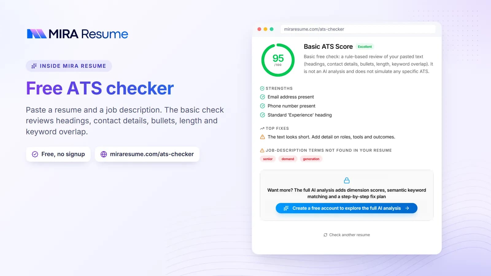
Upload your file to an ATS checker to catch layout problems, missing sections, and missing keywords from a job post. For feedback on bullets and grammar, try the resume checker. Note that no checker can copy one employer's exact software, so use the result as guidance and not as a verdict.
Scannable resume vs. creative resume
Some fields value a designed resume, such as graphic design or marketing roles. You can still keep it scannable.
| Goal | Scannable approach | Creative approach |
|---|---|---|
| Online application | Plain, one-column file | Risky if software reads it badly |
| Networking event or direct email | Plain file works fine | A designed version can stand out, if a person reads it |
| Showing design skill | Link to an online portfolio in plain text | Design inside the resume, tested for readability |
A good compromise is to send the plain file in the application system and keep a designed version for hand-offs. Our guide to creative resume examples shows how to add flair without losing readability.
Build it faster
If you prefer not to set margins and fonts by hand, a builder can do the layout for you. The resume builder starts you with a clean one-column design. Mira Resume exports text-based PDF files and, from the dashboard editor, an editable single-column Word (.docx) file for employers who ask for Word.
Common mistakes that make a resume hard to scan
- Too much on the page. Margins squeezed to fit more text make it hard to read. Cut content instead.
- Long paragraphs. Use short bullets.
- Inconsistent styling. If one job title is bold and another is not, the eye gets confused.
- Using a table or text box for layout. Software may skip or reorder what is inside.
- Burying key facts. Put your strongest points near the top of each section.
- Skipping the test. A resume that looks fine on screen can paste badly.
- Chasing a score. A tool score is a guide. Clear, honest writing matters more.
A scannable resume checklist
- One column, top to bottom.
- Name and contact details in the main body.
- Standard headings: Summary, Skills, Work Experience, Education.
- Common font at 10 to 12 points, plain bullets.
- Short bullets that start with a verb and show a result.
- True keywords from the job post in your summary, skills, and bullets.
- No images, icons, skill bars, or text boxes.
- File with selectable text, passing the copy-and-paste test.
- Passed the five-second skim test with a friend.
- Checked with the ATS checker.
If your resume fails a few items, fix the biggest ones first. The fix my resume guide gives a step-by-step order.
Scannable resume examples: what a quick skim sees
It helps to picture what a reader notices in the first few seconds. Eyes tend to land on your name, your headings, the first words of each bullet, and any bold text. If those spots carry your best information, the skim works in your favor.
| Where the eye lands | What to put there |
|---|---|
| Your name and the line under it | Your target job title or a short descriptor of your field |
| Section headings | Plain names such as Skills and Work Experience |
| Job titles and company names | Bold text, with dates aligned the same way on every job |
| First two or three words of each bullet | A strong action verb, followed by the task |
| The top of page one | Your strongest and most relevant points |
A short before and after of a whole entry
Here is how the same job can look in a hard-to-skim version and an easy-to-skim version. The details are examples only.
Hard to skim: Worked at Greenfield Market from 2021 until now, where my duties included dealing with customers, handling the register, and I also helped with stocking shelves and sometimes trained new people when the manager asked me to.
Easy to skim:
Cashier and Stock Associate, Greenfield Market, Denver, CO
2021 - Present
- Served customers at the register and handled cash and card payments accurately.
- Restocked shelves daily so popular items stayed available.
- Trained new hires on register steps when asked by the manager.
The second version holds the same facts. It simply puts the title, company, and dates where the eye expects them, and breaks the duties into short lines. If you work in retail or food service, our cashier resume guide has more examples.