
What should a resume look like? It should look clean, calm, and easy to scan. Use one column, a common font, clear headings, short bullet points, and plenty of white space. The reader should be able to find your name, your latest job, and your main skills in a few seconds.
This guide shows what a good resume looks like in practice. You will see the ideal layout in a text mock-up, the right order for each section, a table of sizes and margins, and a comparison of good and poor choices. There is also a checklist to use before you save your file.
What does a good resume look like at a glance?
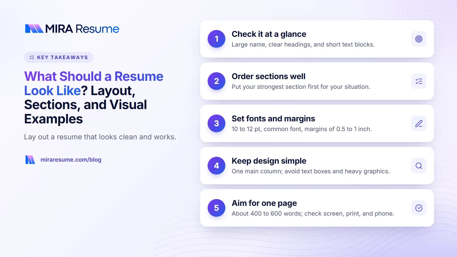
Hold your resume at arm's length or shrink it on your screen. You should be able to see:
- A name at the top that is larger than the rest of the text.
- Clear section headings, such as Experience, Education, and Skills.
- Short blocks of text with space between them, not a wall of words.
- Aligned dates and job titles, so the eye can run down the page.
- Bullet points that are only one or two lines each.
If the page looks crowded or has many colors and boxes, simplify it. A great resume looks plain on purpose. The facts do the work, not the design.
Two readers look at your resume. A person scans it fast, and software reads the text in order. A simple layout helps both. For more on the technical side, see our guide to how to format a resume.
A text mock-up of the ideal resume layout
Here is a picture of a standard one-column resume, drawn in text. Each line shows where a part goes.
MARIA LOPEZ (name, largest text, top left or centered)
Denver, CO | 555-010-7788 | [email protected] | linkedin.com/in/marialopez
SUMMARY (optional, 2 to 3 lines)
Customer success specialist with 4 years of experience helping software users get set up fast...
EXPERIENCE
Customer Success Specialist, BrightDesk, Denver, CO (Jan 2023 to present)
- Resolved about 30 customer tickets a day with a clear, friendly tone
- Wrote 12 help articles that cut repeat questions
- Trained 3 new team members
Support Agent, Mile High Telecom, Denver, CO (Jun 2021 to Dec 2022)
- Answered 60+ calls per shift and logged every case
EDUCATION
B.A. Communication, University of Colorado Denver, 2021
SKILLS
Zendesk, live chat, Excel, ticket triage, Spanish (fluent)
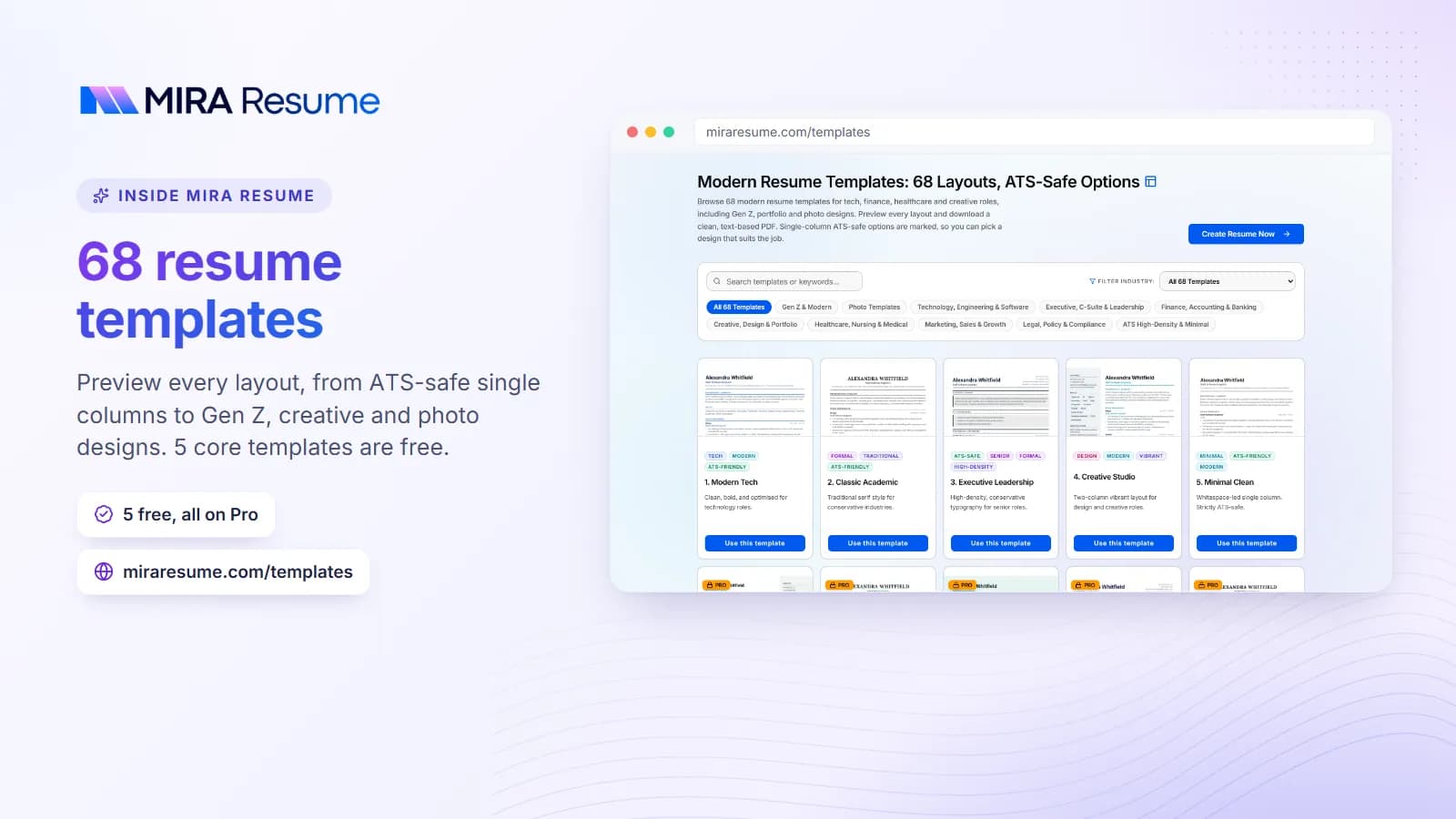
Every resume follows the same shape: header, optional summary, experience, education, skills. People with little work history may put education above experience. If you want to see the shape in real designs, browse our resume templates.
What should a resume look like: sections and order
The order tells the reader what matters most. Put your strongest section first.
| Your situation | Best section order |
|---|---|
| Working for several years | Header, Summary, Experience, Skills, Education |
| Recent graduate | Header, Summary or Objective, Education, Experience or Projects, Skills |
| Career changer | Header, Summary, Skills, Experience, Education |
| Returning after a break | Header, Summary, Experience (with a short note on the break), Skills, Education |
| Technical role | Header, Summary, Skills, Experience, Projects, Education |
Use standard heading names. "Work Experience" is easy for people and software to understand. "My Journey" is not. Inside Experience, list jobs from newest to oldest, with the title and the employer on one line and the dates aligned to the right.
If you choose to include a summary, keep it short, as shown in our resume summary examples. If you are new to the workforce, you may want to start with the resume objective instead.
Fonts, sizes, margins and spacing
Small choices add up. Use this table as a safe starting point.
| Element | Good choice | Why |
|---|---|---|
| Body font | A clean, common font such as Arial, Calibri, Helvetica, Georgia, or Garamond | Reads well on screen and print, and software handles it |
| Body size | 10 to 12 pt | Easy to read without wasting space |
| Name | 16 to 24 pt | Stands out at the top |
| Section headings | 12 to 14 pt, bold, maybe capitals | Helps the eye jump between parts |
| Margins | 0.5 to 1 inch on all sides | Keeps text off the edge and gives breathing room |
| Line spacing | 1.0 to 1.15 | Tight enough for one page, loose enough to read |
| Space between sections | 8 to 12 pt | Separates ideas clearly |
| Colors | Black text, one subtle accent for headings at most | Prints well and looks professional |
Use only one or two fonts across the whole page. Bold for job titles and section headings is enough emphasis. Avoid underlining and italics for long phrases.
Good vs poor resume design choices
Here are the most common design choices and how they compare.
| Choice | A good resume | A poor resume |
|---|---|---|
| Columns | One main column, or a narrow side column for skills only | Several columns and text boxes that confuse reading order |
| Graphics | None, or a tiny accent line | Icons, skill bars, charts, and a photo |
| Bullets | Short, begin with a verb, one to two lines | Long paragraphs of five or six lines |
| Dates | Consistent, such as "Jan 2023 to present" | Mixed formats and missing months |
| Headings | Standard names, bold | Clever names, small or light text |
| Contact info | In the body of the page | Hidden inside the header or footer area |
| File type | PDF with selectable text | A flattened image or screenshot |
If your design looks fancy but a scanner cannot read it, it does not help you. Read our guide to how an ATS reads a resume and test your file with our ATS checker.
How long should it be, and what fills the page?
One page is best for most people. A page holds about 400 to 600 words when you use the sizes above. If you fill a page and still have valuable content, move to two pages, but do not stretch a thin resume to fill space.
- Entry level: one page, with education, projects, and part-time work.
- Mid-career: one page if possible, two if every line adds value.
- Senior: up to two pages, with the newest ten to fifteen years in detail.
When the second page holds only a few lines, edit down to one page or add useful material so it is more than a stub. Our guide on resume length goes deeper, and the one-page resume guide shows how to cut without losing the good parts.
How a resume should look for different jobs
People also ask how should a resume look for a creative role compared with an office role. The base rules stay the same, but the details shift.
| Field | Look to aim for | What to watch |
|---|---|---|
| Office, finance, law, admin | Plain, conservative, black text, strong headings | Do not add decoration; readers expect it simple |
| Tech and engineering | Clean, with a skills block near the top and links to projects | Keep the skills list in plain text, not charts |
| Healthcare | Clear sections for licenses and certifications | Put license names and numbers where they are easy to find |
| Trades and warehouse | Simple, practical, easy to read in a minute | Show equipment, safety training, and shifts worked |
| Design and creative | A little more style is fine, such as a color accent | Link to a portfolio, and still keep a text-readable version |
For design-focused roles, see our creative resume examples. If you are moving toward a technical job, the computer science resume guide shows a skills-first layout.
Screen, print, and phone: how it should look everywhere
Your resume will be seen in three places, and a good one looks right in all of them.
- On a computer screen. Many recruiters read the file in a viewer. Check that nothing is cut off at the edges.
- On paper. Some interviewers print it. Black text on a white page is the safest. Light grey text or pale colors can vanish in print.
- On a phone. Open your PDF on your own phone. If you must zoom in to read it, the text may be too small or the layout too busy.
Test your resume in all three before you send it. It only takes a minute and catches problems early, such as text that is too small, lines that wrap awkwardly, or a heading stranded at the bottom of a page.
A bullet point that looks right
Even the page layout can be perfect and the bullets weak. A good bullet is short, starts with a verb, and shows a result.
| Looks weak | Looks strong |
|---|---|
| Responsible for handling customer emails. | Answered about 40 customer emails a day within one business day. |
| Worked on the website. | Updated product pages for a 200-item online store. |
| Helped the team with tasks. | Prepared weekly schedules for a team of 12. |
Use only figures you can explain. If you have no number, name the tool, the scope, or the outcome instead. For starter verbs, see our list of action verbs for resume bullets.
Common resume layout mistakes
- Cramming. Shrinking the margin to 0.2 inch or the font to 8 pt makes the page tiring to read. Cut text instead.
- Leaving big empty gaps. A half-empty page looks unfinished. Spread the spacing evenly or add a useful section.
- Inconsistent formatting. If one job title is bold, all should be. Check dates, bullets, and capitals.
- Too many styles. Mixing four fonts, three colors, and boxed headings looks messy.
- Using a template with a photo by default. Remove it in countries where photos are not expected.
- Sending a Word file that shifts. Open layouts can change on another computer. Save a PDF so the page stays the same.
- Not checking on mobile. Recruiters may open it on a phone. Test it there.
Final look-and-feel checklist
- Is there one clear name at the top, with contact details?
- Are all headings standard and styled the same way?
- Are fonts simple and sizes between 10 and 12 pt?
- Do margins sit between 0.5 and 1 inch?
- Are bullets short and aligned?
- Are dates in one format?
- Is the page one column, with no icons or text boxes?
- Does it fit on one or two full pages?
- Is the file a PDF you can select text from?
To get a clean look without fiddling with margins, try the resume builder, which sets up the structure for you. You can then check typography ideas in our upcoming guide to resume fonts.