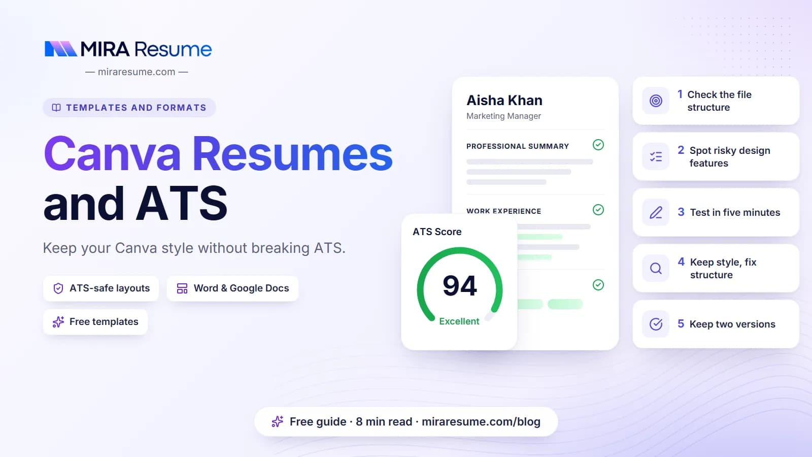

Many people start with Canva resumes because the templates look polished and the tool is easy to use. That is a fair reason. Canva is a good design tool, and nothing is wrong with using it. The question is not whether Canva is good or bad. The question is whether the specific file you make can be read by hiring software.
Some employers use an applicant tracking system, or ATS, to collect resumes and pull out names, jobs and dates. Design-heavy files can trip it up. In this guide, you will learn which features cause trouble, how to test your own file, and how to get a good-looking, safe result. We also say plainly when a designed resume is fine.
The short answer: it depends on how the file is built
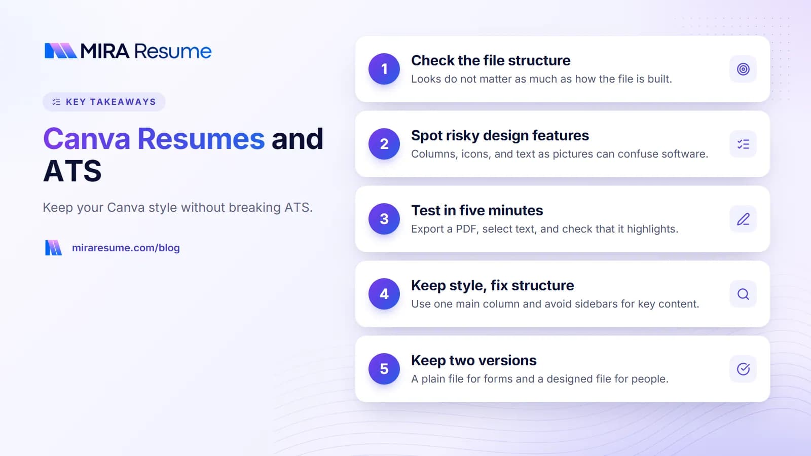
A resume made in Canva is not automatically ATS friendly, and it is not automatically a problem either. What matters is the structure of the finished file.
Hiring software reads a document more like a screen reader than like a person. It looks for text in a logical order, from top to bottom. It does not see color, style or the overall mood of the page. So a resume that looks tidy to you can still read as a jumble to software if the text sits in odd places.
We cannot tell you how every employer's system behaves. Each company sets up its own tools, and they change over time. What we can do is point to the features that commonly cause trouble and give you a way to test your own file. If you want the background on how this software works, read how an ATS works.
When a designed resume is perfectly fine
- You are handing it to a person at an event or an interview.
- You are emailing it directly to someone in a small studio or agency.
- You are attaching it as a second, visual version beside a plain one.
- The job asks for a portfolio and design is part of the work.
When plain is the safer path
- You are applying through an online form that asks you to upload a file.
- You are applying to a large employer with a high number of applicants.
- The role is in an area like finance, health, law, government or operations, where clear structure is the norm.
Design features that can hurt ATS reading
Here is a plain comparison of common Canva-style features and how they can affect reading. The notes say "can" and "may" because results vary from one system to the next.
| Design feature | Possible problem | Safer choice |
|---|---|---|
| Two or three columns | Text may be read across the page, mixing your sidebar with your jobs | One main column, or a narrow sidebar with only minor items |
| Text boxes stacked on a canvas | Reading order may follow how boxes were added, not how they look | Fewer boxes, placed in a top-to-bottom order |
| Icons for phone, email and location | Icons can turn into odd characters or be dropped | Write the words or just the details |
| Skill bars, circles and star ratings | Nothing readable for software, and vague for people | List the skill in text with a short example |
| Headings built as images | Software cannot read a picture of words | Real text headings |
| Decorative fonts | May be swapped or garble when text is extracted | Common fonts with clear letters |
| Contact details in a header strip | Header and footer areas are sometimes skipped | Put contact details in the main body |
| Photo or large graphics | Not read, can push text around | Leave out unless the job and country expect it |
| Whole page saved as an image | No text at all for software to read | Export a PDF where text can be selected |
The last row is the most serious. If your file has no selectable text, the software may find nothing. Test for this in the next section.
How to test your Canva resume in five minutes
You do not need special skills to check your file. Try these steps.
- Download as PDF. Use a PDF with standard settings so text stays as text.
- Select the text. Open the PDF and drag your mouse across a job entry. If the words highlight, they are real text. If a whole block highlights as one box, it may be an image.
- Copy and paste. Copy the whole page into a plain notepad. Read it from top to bottom. Is your name first? Do the jobs stay with their dates? Does the sidebar land in the middle of a sentence?
- Look for missing items. Check whether your email, phone number and any icons came through correctly.
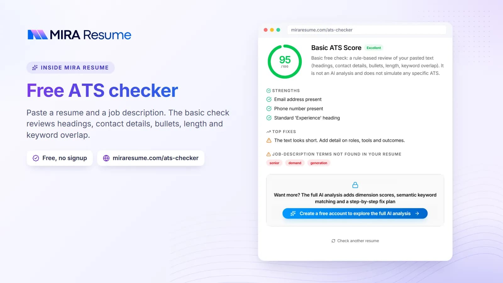
- Run an ATS check. Upload the file to an ATS checker to see how a parser reads it and what it flags.
What the copy-and-paste test tells you
The pasted text is a rough picture of what software sees. If it looks like a clean, ordered resume, you are in good shape. If lines from different sections are woven together, the layout needs work. This test is simple but surprisingly useful.
Check for links
Make sure your email address and LinkedIn link appear as visible text, not only as a clickable icon. Software cannot click, and a printed copy cannot either. For ideas on what to include, see our guide on resume templates for Google Docs, which covers similar layout traps.
How to keep the look and fix the structure
You can keep much of the style you like and still make the file safe. Here are changes that cost little and help a lot.
Simplify the layout
- Move to one main column, with all jobs and education in a single flow.
- If you keep a sidebar, use it only for small extras like languages or tools, and keep the key items in the main column.
- Remove stacked boxes. Use a few clean text blocks in a top-to-bottom order.
Use style that does not depend on structure
- Use a single accent color for headings and thin lines.
- Choose a clear font and keep it consistent.
- Add spacing and section breaks to make the page easy to scan.
- Bold your job titles. Bold is plain text style and is safe.
Swap graphics for words
| Instead of this | Write this |
|---|---|
| A phone icon next to the number | Phone: 555-010-2244 |
| Four out of five stars for Excel | Excel: built weekly sales reports with pivot tables |
| A progress bar for English | English: native, written and spoken |
| A logo for each employer | The employer name in text |
Last, rename headings to the common names: Summary, Experience, Education, Skills. Fun labels look nice but may not be recognized. Our ATS friendly CV template guide shows the full plain layout.
Two-file strategy: one plain, one designed
If you love the visual side, you do not have to give it up. Many job seekers keep two versions of the same resume with the same facts.
| Version | Use it for | Style |
|---|---|---|
| Plain version | Online application forms, job boards, recruiters who upload to a system | One column, standard headings, minimal color |
| Designed version | Handing to a person, emailing a hiring manager, portfolio sites | Your preferred style, still with real text |
Keep the content the same in both so there is no mismatch. Update both when your details change. That small habit saves trouble later.
Where Mira Resume fits
If you want a clean file without wrestling a design canvas, Mira Resume gives you ready-made templates. Many are single-column, plain-text designs made to read well in hiring software, and a few are more styled. You fill in your details and download a PDF, with A4 or US Letter paper. You can also download a plain, single-column Word (.docx) version. You cannot drag boxes around, which is exactly what keeps the structure tidy. See the resume templates to compare looks, or try the resume builder.
How to decide which version to send
Read the job post and the way you are asked to apply. If there is an upload button on a company site, send the plain file. If a person gave you their email and asked for your resume, either version is fine, and the designed one may help you stand out. If you are unsure, send the plain one. It is the version least likely to cause a problem, and you can bring the designed one to an interview.
A note on fairness: Canva is built for flexible design, and Mira Resume is built for structured resumes. They solve different problems, and some people use both.
A safe layout you can recreate in any tool
Whether you build in Canva or elsewhere, this order works well. The sample below is invented and shows the shape of a clean page.
Jordan Ellis
Austin, Texas | 555-010-9087 | [email protected] | linkedin.com/in/jordanellis
Summary
Social media coordinator with three years of experience planning posts, writing captions and reporting on results. Comfortable with design tools and basic video edits.
Experience
Social Media Coordinator, Bright Path Co., Austin
2023 to Present
- Plan and schedule about 15 posts a week across three channels.
- Build simple graphics and short videos for campaigns.
- Track results in a weekly report for the marketing lead.
Content Intern, Lone Star Media, Austin
2022 to 2023
- Wrote captions and blog drafts.
- Helped keep a shared content calendar.
Education
B.A. in Communications, University of Texas at Austin, 2022
Skills
Content planning | Copywriting | Canva | Social media scheduling tools | Basic analytics
Notice that a design skill such as Canva is listed as text in the Skills section. It is fine to show you can use design tools. Just let the resume itself stay readable. Pair a layout like this with the right wording by reading our guide to resume summary examples.
Common mistakes with Canva resumes
- Picking by looks only. The preview shows a styled page, not how software will read it.
- Exporting as an image. A PNG or JPG has no text for software. Use a PDF with selectable text.
- Using a sidebar for key content. Put your jobs and education in the main column.
- Rating skills with bars. They say little to people and nothing to software.
- Stuffing in too much. Dense pages with tiny text are hard to read in any tool.
- Using the template wording. Sample text that sounds good is not your experience. Write your own.
- Skipping the test. A two-minute copy-and-paste check can save you from sending a broken file.
- Forgetting the job post. Matching your words to the job matters more than any template. See skills to put on a resume.
If you want a quick second opinion, run your final PDF through the ATS checker before you apply.