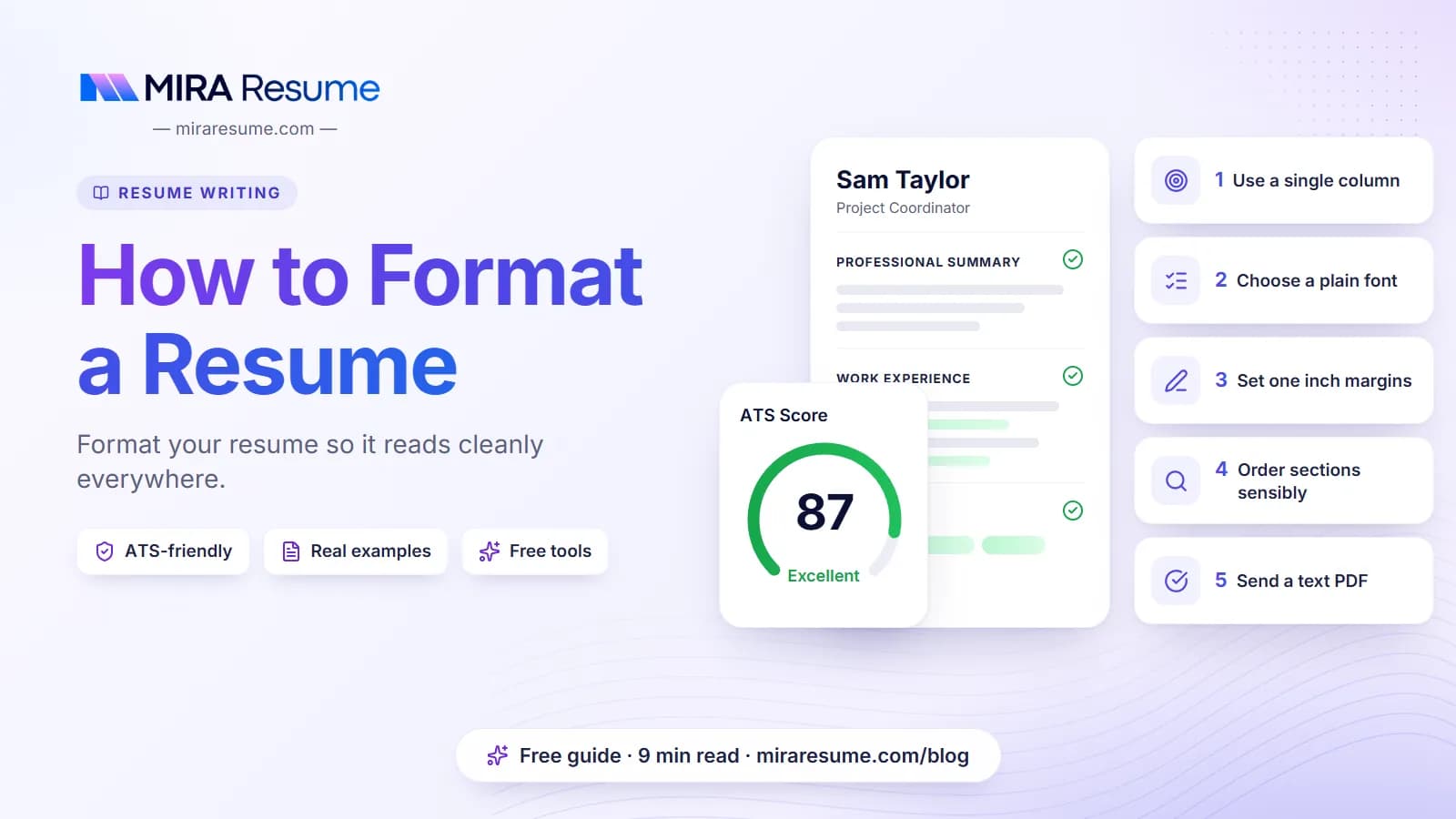

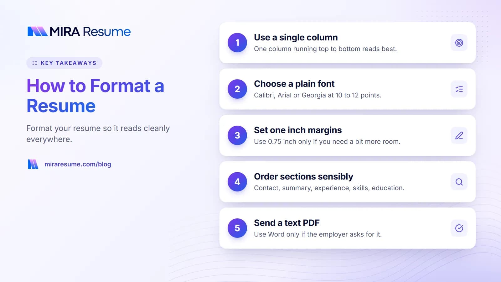
How to format a resume comes down to a few simple choices: one column, a plain font, even margins, clear section headings, and a file type that keeps the layout intact. Do those well and your resume is easy for a person to scan and easy for software to read.
Good formatting will not replace strong content, but bad formatting can hide it. Below you will find the best fonts and sizes, standard margins, spacing rules, the right section order, and when to send a PDF or a Word file. There is a settings table you can follow, plus a list of mistakes to avoid. Employers differ, so always follow any instructions in the job posting first.
The quick answer on how to format a resume: settings that work
If you only have two minutes, use these settings. They suit most jobs in most industries.
| Element | Recommended setting | Notes |
|---|---|---|
| Font | Calibri, Arial, Helvetica, Georgia, Garamond, Cambria or similar | Pick one font, or one for headings and one for body |
| Body text size | 10 to 12 points | 11 is a safe middle |
| Name at the top | 16 to 24 points | The largest text on the page |
| Section headings | 12 to 14 points, bold or capitals | Same style for every heading |
| Margins | 0.75 to 1 inch on all sides | Never below 0.5 inch |
| Line spacing | 1.0 to 1.15 | A little more space between sections |
| Layout | One column | Avoid text boxes and side panels |
| Bullets | Simple round dots | Four to six per recent job |
| Page size | Letter in the US and Canada, A4 elsewhere | Match the country you apply in |
| File type | PDF, unless the posting asks for Word | Name it clearly |
The rest of this guide explains each choice so you can adjust it for your own situation.
Pick a layout that is easy to read
The layout is the shape of your page. For nearly every job, a single column that runs top to bottom works best. Readers move their eyes down the page, and so do most resume-reading programs.
Applicant tracking systems (ATS) are programs that store and sort resumes. Some of them read text in the order it sits in the file. Two columns, tables used for layout, and text boxes can scramble that order, so your skills might land in the middle of a job description. You can read more in how ATS works.
Layout choices at a glance
- Single column: the safest option and a good default.
- Two columns: can look neat, but test it first. If you use one, keep the main content (experience) in the wide column and short items (skills, languages) in the narrow one.
- Graphics, icons and charts: skills bars and star ratings tell a reader very little and software cannot read them. Write the skill as text.
- Photos: in the US, Canada and the UK they are usually left off. Some countries expect them. Check local norms.
For a deeper look at plain layouts, see our simple resume format guide, or pick a ready-made design from the resume templates.
The best resume font and font size
A resume font should be clear on a screen and on paper. Stay with fonts that most computers already have, so the file looks the same for the person who opens it.
| Font | Style | Good for |
|---|---|---|
| Calibri | Sans-serif, soft and modern | Almost any job; the default in many Word versions |
| Arial or Helvetica | Sans-serif, very plain | Technical, office and healthcare roles |
| Georgia | Serif, easy on the eyes | Education, writing and business roles |
| Garamond | Serif, a bit smaller on the page | Law, publishing; use 11 or 12 points |
| Cambria | Serif, sturdy | Finance, administration, management |
| Times New Roman | Serif, traditional | Acceptable, but looks dated to some readers |
Resume font size
Use 10 to 12 points for body text. Under 10 points is hard to read, especially for older eyes or on a phone. If you are tempted to go below 10 to fit more words, cut words instead. Our guide on how many pages a resume should be shows how.
Fonts to avoid
Skip script fonts, handwriting fonts, and anything that looks like a poster. They can be hard to read and may not display on another person's computer. Comic Sans and Papyrus are common examples that make a resume look less serious.
Use bold for job titles and section headings, and italics sparingly for dates or locations. Do not use all three of bold, italics and underline on the same line.
Resume margins and spacing
White space is not wasted space. It gives the eye a place to rest and it makes your resume look calm and organized.
Standard resume margins
One inch (2.5 cm) on all four sides is the standard. If you need a little more room, 0.75 inch is fine. Margins under 0.5 inch can look cramped and may get cut off when printed. Keep the left and right margins equal so the page looks balanced.
Spacing that keeps things tidy
- Line spacing: 1.0 to 1.15 for body text.
- Between sections: add 10 to 14 points of space before each heading.
- Between jobs: add 6 to 8 points so each role stands apart.
- Between bullets: 2 to 3 points, or none if the lines are short.
| If your resume is... | Try this first | Avoid |
|---|---|---|
| A few lines over one page | Cut the weakest bullets and old jobs | Shrinking the font below 10 points |
| Packed with no breathing room | Raise spacing before headings | Adding more text |
| Half empty on page two | Trim to one page or add real, relevant results | Padding with filler |
| Uneven on the left edge | Left-align all text | Justified text, which can leave odd gaps |
Left-aligned text is easiest to read. Reserve centering for your name and contact line.
Section order: what goes where
Most readers look at the top third of the page first, so put your strongest material there. The usual order is below. Change it to suit your history.
- Name and contact details: name, city and state (a full street address is not needed), phone, professional email, and a link to your LinkedIn profile. See how to put LinkedIn on a resume.
- Summary or objective (optional): two to four lines. Read about the resume summary or the resume objective.
- Work experience: newest job first, with bullets.
- Skills: a short, honest list; see skills to put on a resume.
- Education: degree, school, year. New graduates can move this above experience.
- Certifications and extras: licenses, languages, volunteer work.
Use standard headings
Call sections what most people call them: "Work Experience", "Education", "Skills". Creative names such as "My Journey" or "What I Bring" can confuse software that looks for known labels.
Dates and job entries
Pick one date style and stay with it, such as "Mar 2022 to Jun 2025" or "03/2022 - 06/2025". Put the job title, company, city and dates on one or two lines. Add your bullets underneath.
A layout you can copy
Here is a plain text outline of a well-formatted resume. Use it as a map for your own file.
AVA MARTINEZ (18 pt, centered)
Denver, CO | 555-0100 | [email protected] | linkedin.com/in/avamartinezSUMMARY (12 pt, bold)
Office coordinator with 5 years of experience in scheduling and records. Keeps a 30-person team organized with clear calendars.WORK EXPERIENCE
Office Coordinator, Bright Dental Group, Denver, CO
Mar 2022 to Present
- Scheduled appointments for 6 providers using Dentrix.
- Cut missed appointments by sending text reminders each week.
- Trained 3 new front desk staff on check-in steps.EDUCATION
Associate Degree in Business Administration, Front Range Community College, 2021SKILLS
Microsoft 365, Dentrix, scheduling, record keeping, customer service
Notice what is missing: no photo, no boxes, no icons, no skill bars. Everything is plain text in a logical order.
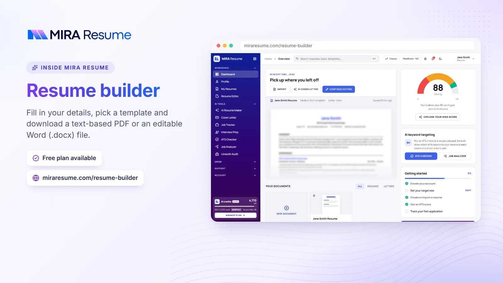
If you prefer to start from a designed page instead of formatting by hand, the resume builder places your content into clean, one-column templates that follow these rules.
PDF or Word: which file type should you send?
Both can work. The right choice depends on what the employer asks for.
| File type | Strengths | Watch out for |
|---|---|---|
| Looks the same on every device; fonts and spacing stay put | Must be a text PDF, not a scanned picture of a page | |
| Word (.docx) | Easy for a recruiter to edit; some systems prefer it | Layout can shift on another computer or version |
| Plain text (.txt) | Only needed if a form asks for it | No formatting at all |
| Image (.jpg, .png) | None for resumes | Software cannot read the text |
The simple rule: send what the posting asks for. If it says nothing, a text-based PDF is a safe, tidy choice. To check that yours is readable, select a line of text in the PDF. If you can highlight it, software can usually read it too. Mira Resume downloads resumes as PDF files, so if an employer asks specifically for Word, you would need to build that version in a word processor.
Name your file well
Use something like Ava-Martinez-Resume.pdf. Avoid "resume-final-v3-new.pdf". A clear name helps the recruiter find your file later.
After saving, run it through the ATS checker to see how a scanner reads your text and where it might stumble.
Common resume formatting mistakes
- Too many fonts or colors. One or two fonts and, at most, one subtle accent color keep the page professional.
- Tiny text and tiny margins. If you must squeeze to fit, there is too much content.
- Putting key details in the header or footer. Some systems skip those areas. Keep your contact details in the main body.
- Using tables and text boxes for layout. They can break reading order.
- Odd bullet symbols. Arrows, stars and emojis may turn into strange characters. Plain dots are safest.
- Inconsistent style. If one job title is bold, all should be. If one date is "Jan 2021", all should follow that pattern.
- Dense paragraphs. Use bullets for achievements. Keep each bullet to one or two lines.
- Skipping a proofread. Read the final PDF, not just the editing view, and ask a friend to check it.
Once the format is clean, make sure the words are strong too. Start bullets with the action verbs for resume lists, and check the full list of things to put on a resume so you do not leave out a key section.
A final formatting check before you send
Run through this list once your resume is finished.
- Open the PDF on your phone and on a computer. Does it look the same?
- Can you select and copy the text? If not, it may be an image.
- Do all section headings use the same size, weight and spacing?
- Are all dates in the same style and lined up on the page?
- Is the left edge straight, with bullets indented the same distance?
- Does the resume fit the page count you aimed for, without a lonely line on page two?
- Does your name stand out as the largest text?
- Have you read every word aloud at least once?
Taking five minutes for this check can catch problems that a hiring manager would notice in five seconds.